
MINING CLAIM
Parcel Land Directory
MINING CLAIM
Parcel Land Directory
PROJECT NAME
Mining Claim
DELIVERABLES
Logo Redesign
Business Cards
SOFTWARE UTILIZED
Adobe Illustrator
Adobe Photoshop
PROJECT NAME
Mining Claim
DELIVERABLES
Logo Redesign
Business Cards
SOFTWARE UTILIZED
Adobe Illustrator
Adobe Photoshop
DESIGN BRIEF
Mining Claims are a valuable asset to many landowners and investors. This particular organization manages a large database listing of land parcels that are available for lease or purchase for those interested in mining the land for different mineral deposits. They came to us with an extremely out-dated logo that was difficult to read, had many separate elements making it look very busy and it did not scale well. They needed a completely new logo design that was simple and strong and was able to be utilized in various projects.
CREATIVE PROCESS
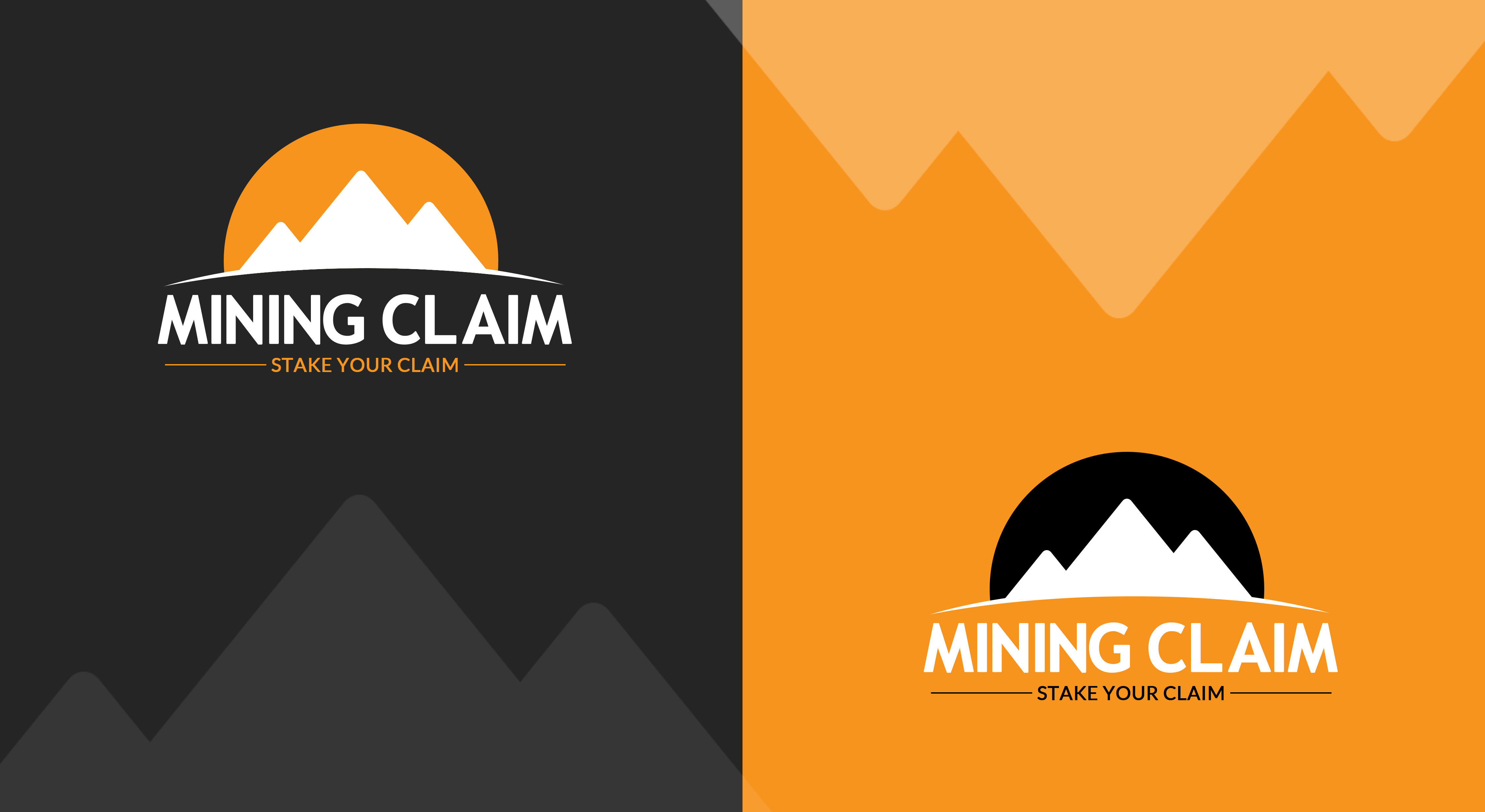
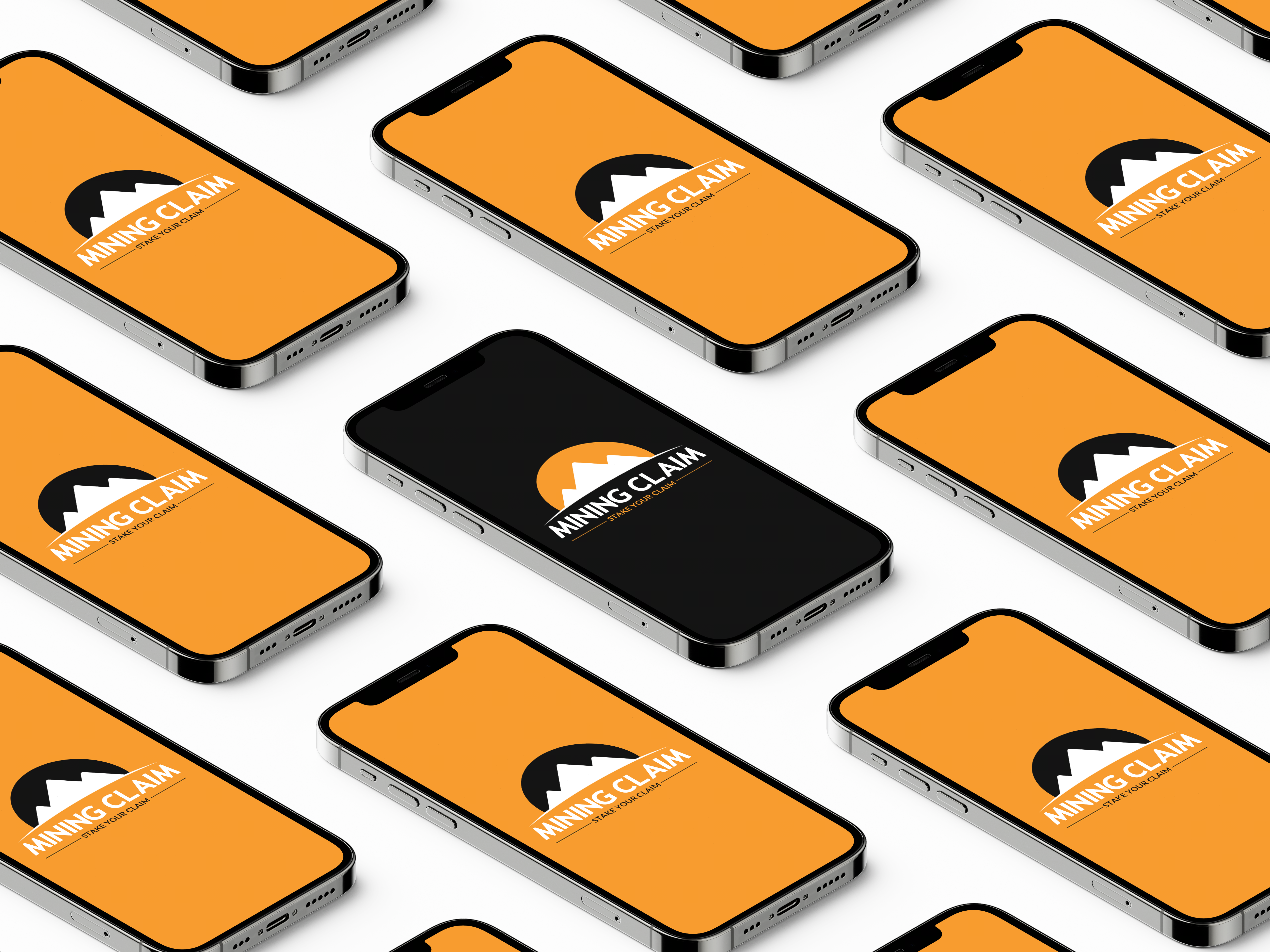
I began this creative process by gathering some information on this very uncommon business model. I then took an existing idea and removed all busy elements to bring it back down to it’s root purpose and gave it a more modern and outdoorsy feel. From there I redesigned the desired elements we agreed to keep to create a simple but cohesive design which more authentically represents the organization. The logo transitions really well between color, black/white, and grayscale. The quality is now such that it can be scaled down significantly or blown up to any size without losing any bit of fidelity or consistency.
DESIGN BRIEF
Mining Claims are a valuable asset to many landowners and investors. This particular organization manages a large database listing of land parcels that are available for lease or purchase for those interested in mining the land for different mineral deposits. They came to us with an extremely out-dated logo that was difficult to read, had many separate elements making it look very busy and it did not scale well. They needed a completely new logo design that was simple and strong and was able to be utilized in various projects.
CREATIVE PROCESS
I began this creative process by gathering some information on this very uncommon business model. I then took an existing idea and removed all busy elements to bring it back down to it's root purpose and gave it a more modern and outdoorsy feel. From there I redesigned the desired elements we agreed to keep to create a simple but cohesive design which I believe more authentically represents the organization. The logo transitions really well between color, black/white, and grayscale. The quality is now such that it can be scaled down significantly or blown up to any size without losing any bit of fidelity or consistency.
CHECK OUT SIMILAR PROJECTS
CHECK OUT SIMILAR PROJECTS

